Dean Yoo.
Home
About
Work
Contact
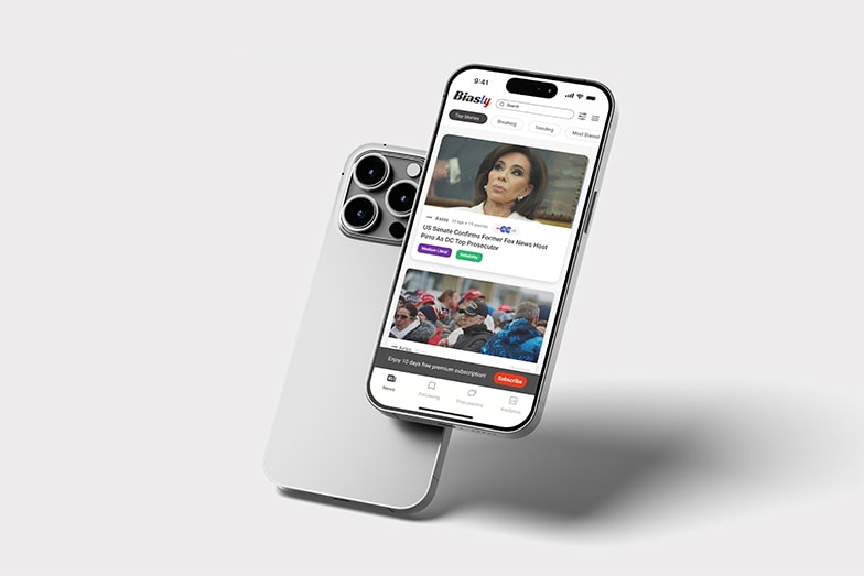
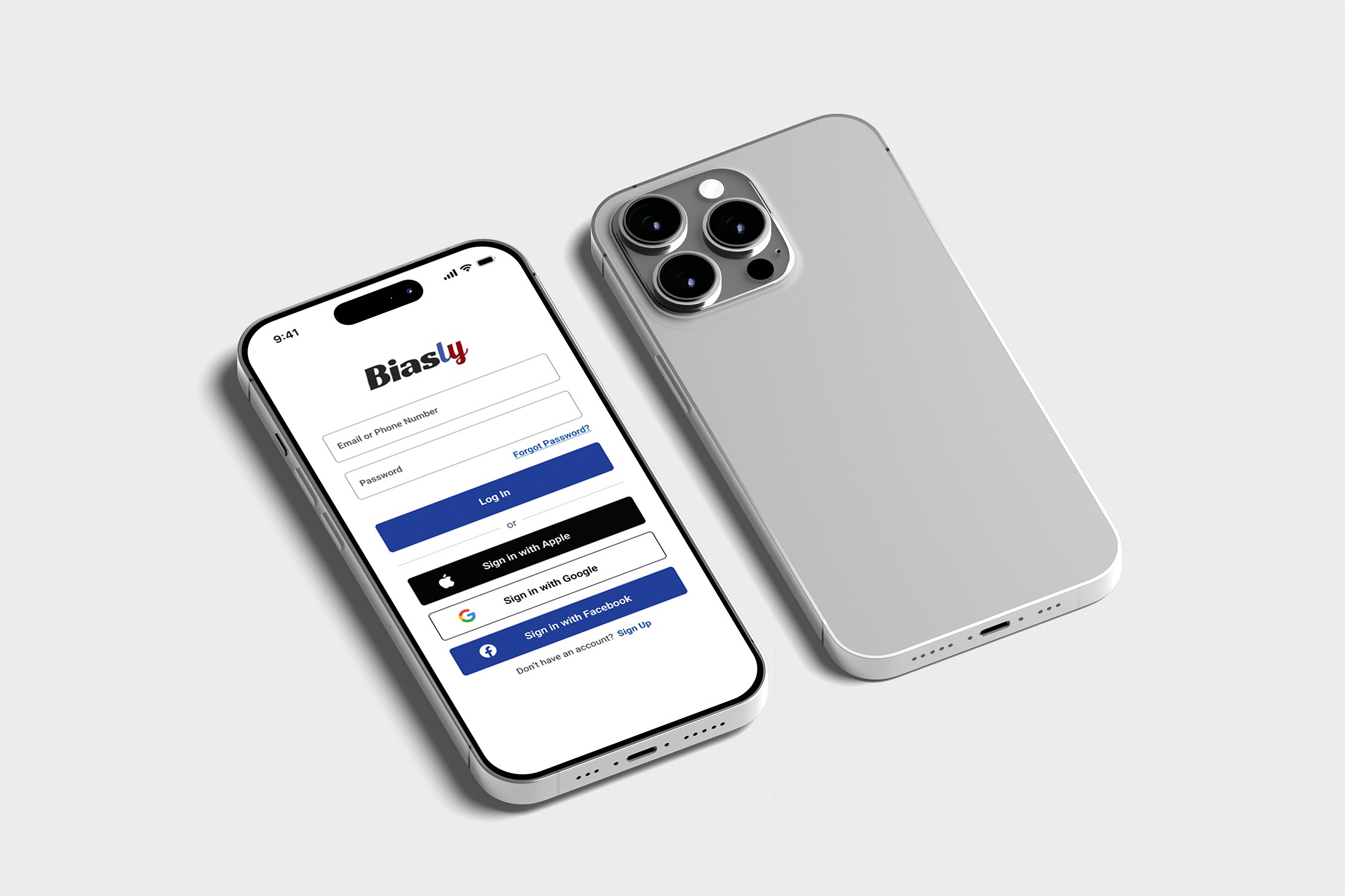
Biasly Mobile App
A bias-aware news app that helps users understand political content through intuitive, user-centered design.
Role
UI/UX Designer
Duration
1.5 months
Team
1 designer
Platform
iOS & Android
Project Overview
Political information is often overwhelming and hard to navigate. During my UI/UX internship at Biasly, I designed a mobile app that simplifies complex content while maintaining transparency and neutrality
The goal was to create an intuitive, bias-aware interface that helps users quickly understand political issues through clear hierarchy and accessible design

Simplified complex political data through clear UI hierarchy

Designed mobile-first navigation for clarity and accessibility

Focused on transparency and bias-aware content presentation
The Challenge

Overwhelming political content

Perceived bias and distrust

Complex data on mobile

Low engagement
The Solution

Simplified with clear hierarchy

Added transparent bias indicators

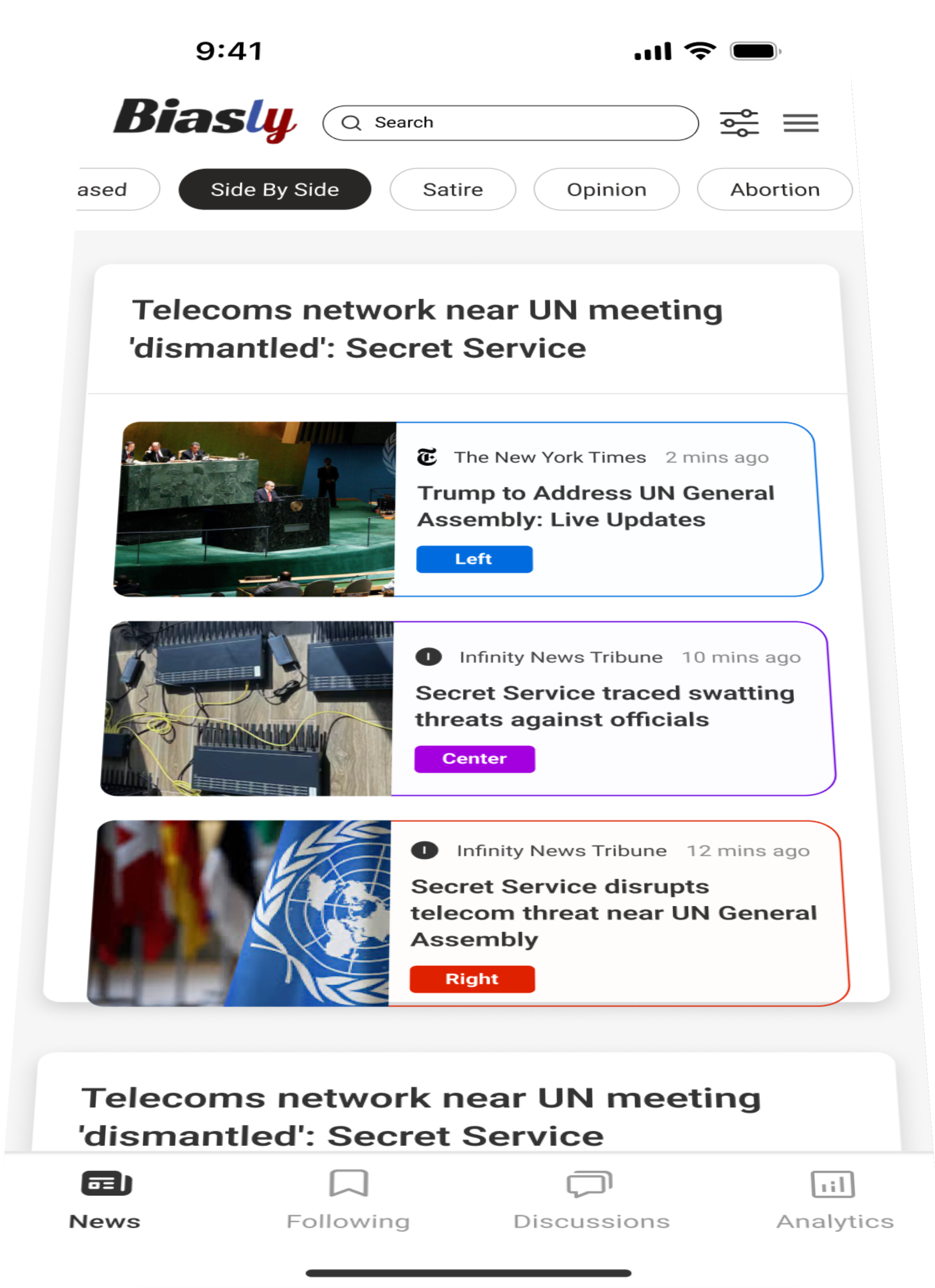
Visualized data for quick understanding

Designed mobile-first, scannable flows
Design Process

Research
User interviews and market analysis to understand pain points

Ideation
Brainstorming sessions and concept development

Design
Wireframing, prototyping, and visual design

Testing
User testing and iteration based on feedback
Design System
Colors
#0A4EA8
#99241B
#333333
#FFFFFF
Typography
Heading 1
Roboto Bold 32px
Heading 2
Roboto Semibold 20px
Body Text
Roboto Regular 16px
Components
Primary Button
Secondary Button
Input Field
Final Designs
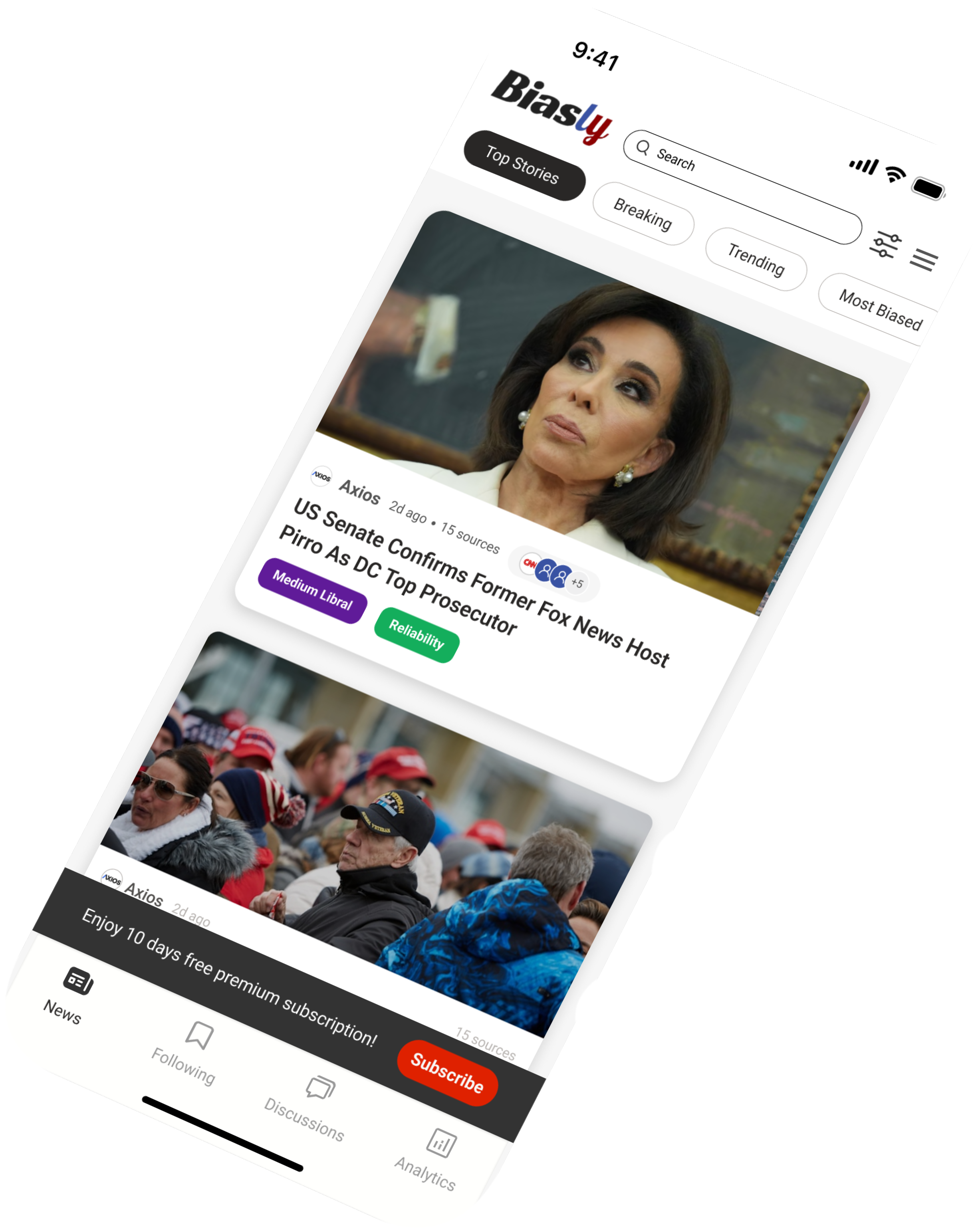
Dashboard
Simplified overview with quick actions and balance visibility
Plan Flow
Personalized budgeting with clear goal tracking and spending breakdowns
Rewarding System
Built-in rewards to motivate goal completion and financial growth


Results & Impact
63%
Content Clarity Improvement
Users found political topics easier to understand through simplified hierarchy
56%
Trust & Transparency Increase
Bias indicators and side-by-side views improved perceived neutrality and trust
49%
Daily Engagement Boost
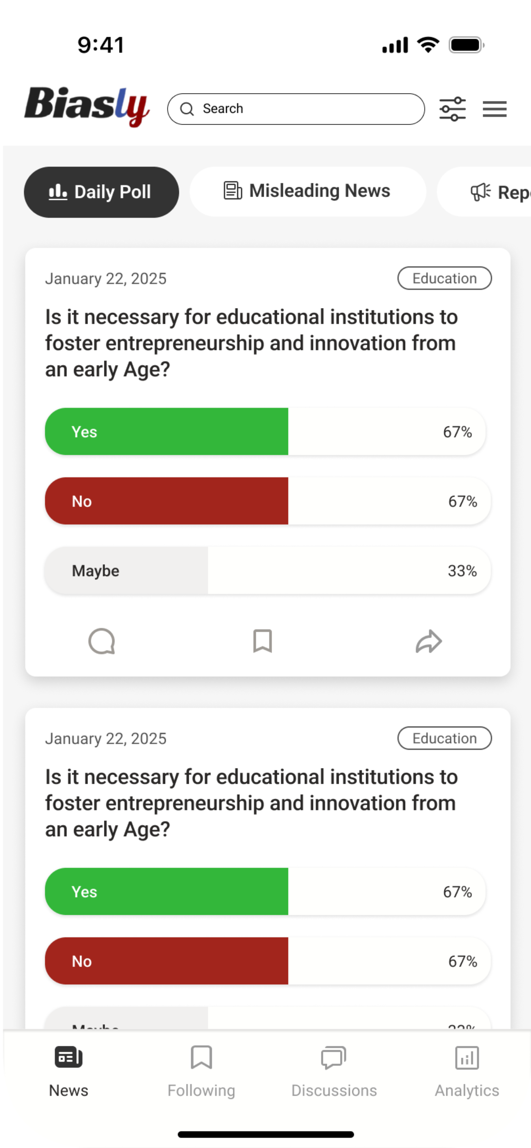
Interactive features like Daily Polls encouraged repeat usage
Key Learnings
This project emphasized the importance of clarity and transparency when designing complex, sensitive content. Simplifying information while preserving meaning was key, and interactive elements helped sustain engagement. Future iterations will focus on deeper personalization and expanded comparative tools.
Next Project
Finflow (Mobile App)
View Project

Dean Yoo.
UX/UI Designer passionate about creating meaningful digital experiences


Get In Touch
hyart@2021@gmail.com
Chicago, IL
© 2025 Dean Yoo. All rights reserved.
Dean Yoo.
Home
About
Work
Contact
Biasly Mobile App
A bias-aware news app that helps users understand political content through intuitive, user-centered design.
Role
UI/UX Designer
Duration
1.5 months
Team
1 designer
Platform
iOS & Android
Project Overview
Political information is often overwhelming and hard to navigate. During my UI/UX internship at Biasly, I designed a mobile app that simplifies complex content while maintaining transparency and neutrality
The goal was to create an intuitive, bias-aware interface that helps users quickly understand political issues through clear hierarchy and accessible design

Simplified complex political data through clear UI hierarchy

Designed mobile-first navigation for clarity and accessibility

Focused on transparency and bias-aware content presentation
The Challenge

Overwhelming political content

Perceived bias and distrust

Complex data on mobile

Low engagement
The Solution

Simplified with clear hierarchy

Added transparent bias indicators

Visualized data for quick understanding

Designed mobile-first, scannable flows
Design Process

Research
User interviews and market analysis to understand pain points

Ideation
Brainstorming sessions and concept development

Design
Wireframing, prototyping, and visual design

Testing
User testing and iteration based on feedback
Design System
Colors
#0A4EA8
#99241B
#333333
#FFFFFF
Typography
Heading 1
Roboto Bold 32px
Heading 2
Roboto Semibold 20px
Body Text
Roboto Regular 16px
Components
Primary Button
Secondary Button
Input Field
Final Designs
Dashboard
Simplified overview with quick actions and balance visibility
Plan Flow
Personalized budgeting with clear goal tracking and spending breakdowns
Rewarding System
Built-in rewards to motivate goal completion and financial growth


Results & Impact
63%
Content Clarity Improvement
Users found political topics easier to understand through simplified hierarchy
56%
Trust & Transparency Increase
Bias indicators and side-by-side views improved perceived neutrality and trust
49%
Daily Engagement Boost
Interactive features like Daily Polls encouraged repeat usage
Key Learnings
This project emphasized the importance of clarity and transparency when designing complex, sensitive content. Simplifying information while preserving meaning was key, and interactive elements helped sustain engagement. Future iterations will focus on deeper personalization and expanded comparative tools.
Next Project
Finflow (Mobile App)
View Project

Dean Yoo.
UX/UI Designer passionate about creating meaningful digital experiences


Get In Touch
hyart@2021@gmail.com
Chicago, IL
© 2025 Dean Yoo. All rights reserved.
Biasly Mobile App
A bias-aware news app that helps users understand political content through intuitive, user-centered design.

Role
UI/UX Designer
Duration
1.5 months
Team
1 designer
Platform
iOS & Android
Design Process

Research
User interviews and market analysis to understand pain points

Ideation
Brainstorming sessions and concept development

Design
Wireframing, prototyping, and visual design

Testing
User testing and iteration based on feedback
Final Designs
Dashboard
Simplified overview with quick actions and balance visibility
Plan Flow
Personalized budgeting with clear goal tracking and spending breakdowns
Rewarding System
Built-in rewards to motivate goal completion and financial growth
Design System
Colors
#0A4EA8
#99241B
#333333
#FFFFFF
Typography
Heading 1
Roboto Bold 32px
Heading 2
Roboto Semibold 20px
Body Text
Roboto Regular 16px
Components
Primary Button
Secondary Button
Input Field
Results & Impact
Key Learnings
This project emphasized the importance of clarity and transparency when designing complex, sensitive content. Simplifying information while preserving meaning was key, and interactive elements helped sustain engagement. Future iterations will focus on deeper personalization and expanded comparative tools.
63%
Content Clarity Improvement
Users found political topics easier to understand through simplified hierarchy
56%
Trust & Transparency Increase
Bias indicators and side-by-side views improved perceived neutrality and trust
49%
Daily Engagement Boost
Interactive features like Daily Polls encouraged repeat usage
Project Overview
Political information is often overwhelming and hard to navigate. During my UI/UX internship at Biasly, I designed a mobile app that simplifies complex content while maintaining transparency and neutrality
The goal was to create an intuitive, bias-aware interface that helps users quickly understand political issues through clear hierarchy and accessible design

Simplified complex political data through clear UI hierarchy

Designed mobile-first navigation for clarity and accessibility

Focused on transparency and bias-aware content presentation
The Challenge

Overwhelming political content

Perceived bias and distrust

Complex data on mobile

Low engagement
The Solution

Simplified with clear hierarchy

Added transparent bias indicators

Visualized data for quick understanding

Designed mobile-first, scannable flows


Biasly Mobile App
A bias-aware news app that helps users understand political content through intuitive, user-centered design.
Role
UI/UX Designer
Duration
1.5 months
Team
1 designer
Platform
iOS & Android
Design Process

Research
User interviews and market analysis to understand pain points

Ideation
Brainstorming sessions and concept development

Design
Wireframing, prototyping, and visual design

Testing
User testing and iteration based on feedback
Final Designs
Dashboard
Simplified overview with quick actions and balance visibility
Plan Flow
Personalized budgeting with clear goal tracking and spending breakdowns
Rewarding System
Built-in rewards to motivate goal completion and financial growth
Design System
Colors
#0A4EA8
#99241B
#333333
#FFFFFF
Typography
Heading 1
Roboto Bold 32px
Heading 2
Roboto Semibold 20px
Body Text
Roboto Regular 16px
Components
Primary Button
Secondary Button
Input Field
Results & Impact
Key Learnings
This project emphasized the importance of clarity and transparency when designing complex, sensitive content. Simplifying information while preserving meaning was key, and interactive elements helped sustain engagement. Future iterations will focus on deeper personalization and expanded comparative tools.
63%
Content Clarity Improvement
Users found political topics easier to understand through simplified hierarchy
56%
Trust & Transparency Increase
Bias indicators and side-by-side views improved perceived neutrality and trust
49%
Daily Engagement Boost
Interactive features like Daily Polls encouraged repeat usage
Project Overview
Political information is often overwhelming and hard to navigate. During my UI/UX internship at Biasly, I designed a mobile app that simplifies complex content while maintaining transparency and neutrality
The goal was to create an intuitive, bias-aware interface that helps users quickly understand political issues through clear hierarchy and accessible design

Simplified complex political data through clear UI hierarchy

Designed mobile-first navigation for clarity and accessibility
Focused on transparency and bias-aware content presentation
The Challenge

Overwhelming political content

Perceived bias and distrust

Complex data on mobile
Low engagement
The Solution

Simplified with clear hierarchy

Added transparent bias indicators
Visualized data for quick understanding
Designed mobile-first, scannable flows


Biasly Mobile App
A bias-aware news app that helps users understand political content through intuitive, user-centered design.
Role
UI/UX Designer
Duration
1.5 months
Team
1 designer
Platform
iOS & Android
Design Process

Research
User interviews and market analysis to understand pain points

Ideation
Brainstorming sessions and concept development

Design
Wireframing, prototyping, and visual design

Testing
User testing and iteration based on feedback
Final Designs
Dashboard
Simplified overview with quick actions and balance visibility
Plan Flow
Personalized budgeting with clear goal tracking and spending breakdowns
Rewarding System
Built-in rewards to motivate goal completion and financial growth
Design System
Colors
#0A4EA8
#99241B
#333333
#FFFFFF
Typography
Heading 1
Roboto Bold 32px
Heading 2
Roboto Semibold 20px
Body Text
Roboto Regular 16px
Components
Primary Button
Secondary Button
Input Field
Results & Impact
Key Learnings
This project emphasized the importance of clarity and transparency when designing complex, sensitive content. Simplifying information while preserving meaning was key, and interactive elements helped sustain engagement. Future iterations will focus on deeper personalization and expanded comparative tools.
63%
Content Clarity Improvement
Users found political topics easier to understand through simplified hierarchy
56%
Trust & Transparency Increase
Bias indicators and side-by-side views improved perceived neutrality and trust
49%
Daily Engagement Boost
Interactive features like Daily Polls encouraged repeat usage
Project Overview
Political information is often overwhelming and hard to navigate. During my UI/UX internship at Biasly, I designed a mobile app that simplifies complex content while maintaining transparency and neutrality
The goal was to create an intuitive, bias-aware interface that helps users quickly understand political issues through clear hierarchy and accessible design

Simplified complex political data through clear UI hierarchy

Designed mobile-first navigation for clarity and accessibility

Focused on transparency and bias-aware content presentation
The Challenge

Overwhelming political content

Perceived bias and distrust

Complex data on mobile
Low engagement
The Solution

Simplified with clear hierarchy

Added transparent bias indicators

Visualized data for quick understanding
Designed mobile-first, scannable flows


